Changes To The Scrollbar
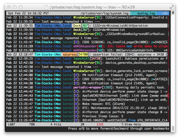
I’ve made some changes to the scrollbar that is shown on the right side of the display based on some feedback from users. The scroll area now has a single vertical line extending from the top to the bottom. Previously, this area would show log message characters and it wasn’t very clear that the scroll bar existed. The line is colored based whether there are errors or warnings in that part of the log. The coloring should make it easier to see the distribution of errors across the whole log. Similarly, there are notches added to the left and right side of the line to show search hits and bookmarks, respectively. See the following screenshot to get an idea of what it looks like:

These changes are currently only in the latest code from git. I’ll be playing with things a bit more before making a release.